B Data Futures
B.1 Andrew: On Visualisations
B.1.1 True Value and Purpose of Visualisations
To consider trends in visualisation let’s begin by identifying the core value of data visualisation - what does it do? In general terms we think about things using language but we understand things using imagery. Our memories work better when we link items to images (even unrelated images) as evidenced by many mnemonic tools.
Data visualisation is the process of presenting information using means other than language as the principal conduit for transfer of meaning/understanding/knowledge. If we think about our senses, 3 of the 5 (touch, smell, taste) are principally involved with our situational awareness. Hearing and sight, whilst obviously having key situational awareness roles, are our principal sources of knowledge awareness/learning at a higher cognitive level. Higher level information that we receive verbally is principally delivered via language - yes we could be learning about sounds themselves in which case there is a combination of non-verbal and verbal but when attending lectures or at work listening to the boss the language is important - doubtless we are also processing a ton of non-verbal messages at work too. At uni and at work our non-situational visible inputs are often computer screens or paper - what Edward Tufte refers to as “flatland”.
So now consider what we look at in flatland - a lot of words and numbers which require processing via our brain’s language centres (Wernicke’s area, Angular Gyrus, Insular Cortex, etc.) before they can be understood. That understanding is very often visual, do you see what I mean? Data visualisations cut out the language middle-man and, because they are not constrained by the bandwidth of our language processing systems, provide a high-speed information channel capable of carrying lots of data very quickly into the “understanding” part of the brain. Language is an incredibly powerful brain function. It is arguably that which lifts humans above other species, more even than opposable thumbs, but it is slow to process compared to image processing - we have been finding meaning in what we see for a lot longer than we have been translating meaning into and out of language.
All this is by way of suggesting that the purpose of data visualisation is to provide a means to convey understanding/knowledge without the use of language. In practice, of course, language is often used to augment/enhance visualisations (scales, labels, titles, explanatory notes) but in many cases the data is just way too dense to be conveyed in any other manner than a visualisation (think picture, thousand words) as evidenced by the most common, oldest and data dense visualisations we have - maps.
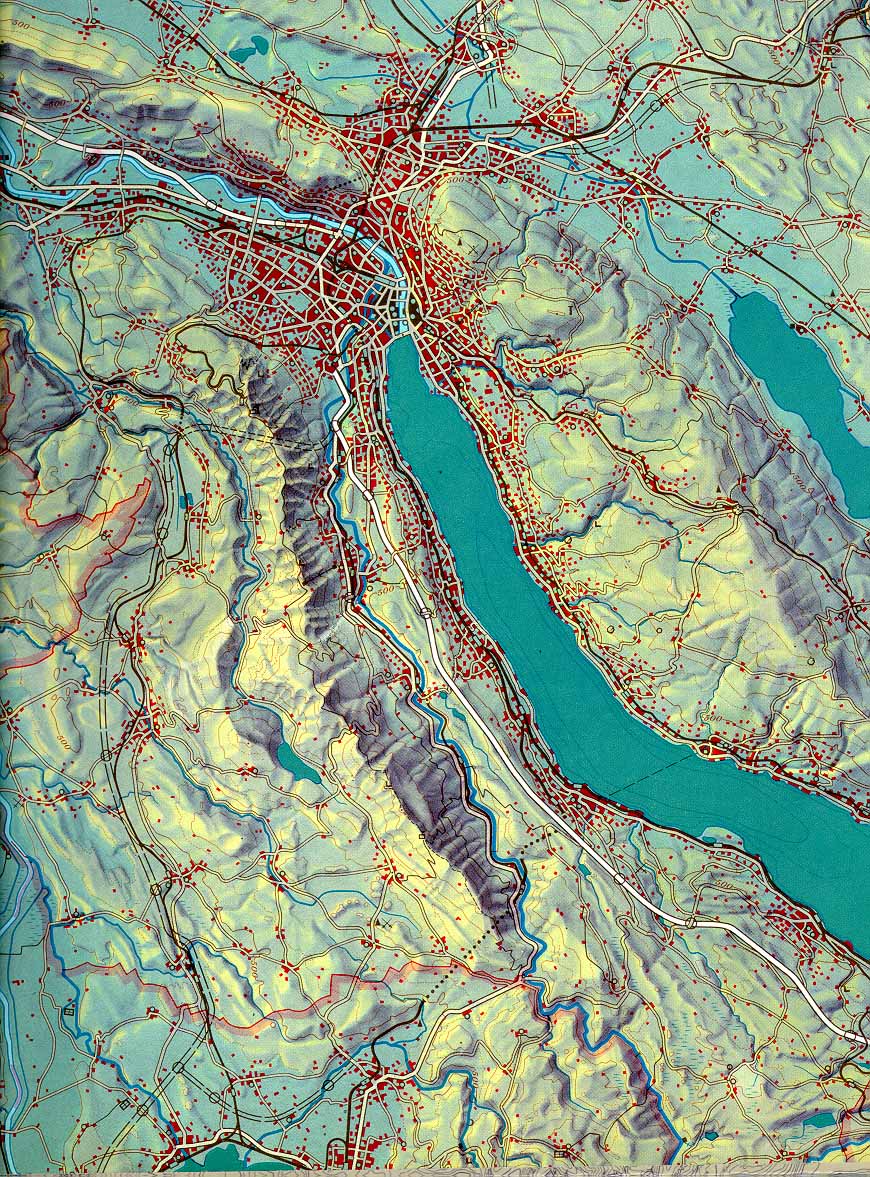
Figure B.1: School map of the Canton of Zurich 1:150 000, Eduard Imhof and collaborator
B.1.2 The Effective Use of Visualisations
This chapter is heavily influenced (as many discussions of visualisation are) by the works of Edward Tufte, the Yoda of data visualisation. Yoda is an appropriate term because his approach is to use many examples of good and bad data visualisation practice and his objective appears to be to guide and advise by providing clarity as to why certain visualisations are easier to understand. He advocates concepts such as:
- minimise use of non-data ink
- remove chartjunk
- avoid harsh palettes
- its okay to have high data density
Perhaps because of the clarity and almost pervasive uptake of Tufte’s guidelines/advice, we are beginning to see more appropriate (gentler) palettes being offered as default colour schemes and more awareness of perception issues (e.g. Moirè effect) in business intelligence tools such as Tableau and Sisense.

Figure B.2: Moirè Effect - Vibrations in the Image
Before diving into trends and fads though, pause to consider and remember that the objective of data visualisations should be to transfer knowledge and understanding via images rather than words. If we understand things ourselves in a visual way and want to transfer that understanding to our reader then we can most simply do that by presenting that information visually.
Are you beginning to understand why all those styles of the 90’s with Moirè effects were so bad?
The effective use of a visualisation to transfer knowledge or information, however, assumes there is knowledge/understanding on the part of the author in the first place. As we turn to tools, technologies, trends and fads consider the risks associated with any mechanism that makes it easier to deliver “information” about data (especially big data) even if the “author” doesn’t understand the data themselves.
B.1.3 Tools, Technologies, Trends and Fads
The first, and possibly most significant, trend of data visualisation is the need for it. Big data is presenting a challenge. A lot of information is being gathered and supporting a conclusion or recommendation based on big data often requires some form of supporting encapsulation/presentation of that information. Overly simplifying large volumes of data risks losing the message behind the detail so visualisation is becoming a more important tool. The volume and depth of data, the need to present multivariate analyses, the complexity of the messages all can be addressed by powerful, well-structured data visualisations.
B.1.3.1 How Big is Yours?
In 1990 Tufte mused on:
the essential dilemma of a computer display: at every screen there are two powerful information-processing capabilities, human and computer. Yet all communication between the two must pass the low-resolution, narrow-band video display terminal, which chokes off fast, precise, and complex communication. (p.89, Envisioning Information, 1990, Edward Tufte)
Clearly, screen resolutions have progressed very significantly since 1990 such that HD displays (e.g. Retina) are providing resolution and colour/contrast ranges much closer to the range of the human eye to perceive. To this we are now adding virtual reality, data walls and data rooms. All of these are permutations of “bigger display spaces” to display more data. Its cool and sexy and great for University PR but does it work? (Doubtless this risks being very unpopular with certain groups at UTS) Does the human mind have the capacity to work in the round, holding context from one part of the room to the next? We have trouble maintaining data context flipping a page so I’ll let you decide how easily we maintain that context turning around. So what does that mean for the super-sexy, very expensive displays - use them wisely. They are not without merit or purpose but just throwing stuff up there to show off risks falling into a world that Tufte might describe as “mega chart junk land”.
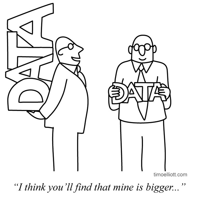
Figure B.3: Mine’s Bigger…
There is an important philosophical point to be made here. If you really need a 360° view of your data to explain it - do you actually understand it that well? It goes back to the underlying requirement that the author understand the message before trying to convey it.
With that said, these new display technologies are understandably being played with, people are learning what can be done and how to do it - hopefully as part of that they will also learn if/when they actually need 360° views (VR, data rooms). Don’t let the medium get bigger than the message.
B.1.3.2 Intelligent Analytics - the Good, the Bad and the Less Ugly
Looking at the array of smart business intelligence tools being brought to market (e.g. Tableau, Sisense, Periscope) it is clear that the integration of data access with data analytics is progressing at pace with a big component of these visualisation tools being their libraries of data access layers and data wrangling tools. This work is directed at removing the peripheral effort from the work involved with analysing and presenting information about data. Visualisation tools are being built/interfaced into stream processing solutions/environments like AWS Kinesis to provide real time data visualisations more simply. Open source tools like Kibana and Elasticsearch are providing accessible functionality while R and Python extensions like Shiny apps, ipywidgets and Bokeh plots are providing similar (if less readily accessible) functionality in the machine learning community space.
The power of the commercial tools to provide tips, advice and suggestions is one of their big commercial selling points and if they are being used for data investigation then this is not a bad thing. It doubtless streamlines the process of investigating and understanding data. If used for this purpose this sort of guided analytics is useful but care needs to be taken that the guidance doesn’t limit the analyst’s ability/willingness to do the hard work to understand all the possible interpretations of the data they are viewing. Worse still, the easier it is to produce good looking visualisations, the greater the temptation/capacity to present data that is not truly understood by the “author” of the visualisation.
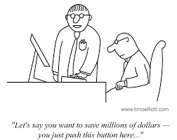
Figure B.4: Simple Really
A scan of the various (newer) data visualisation tools shows an increasing awareness of how to present data (the less ugly). Being a commercial marketplace there remains (at least in the demo side) a preponderance of the gaudy, flashy visualisations but that is to be expected. The move to the pastel palettes, fainter lines, less cluttered, confronting visuals are all improvements on the clunky, flashy graphics of the 90’s and 2000’s but the balance between understanding the data (the message) and the best way to present it so as to be easily consumed by its observer (the medium) remains a challenge. This is not least because there are a lot of skills required for both those tasks.
Thus, data analytics is moving forward in:
- improving access to source data
- improving exposure of data/information (interactive visualisations, live visualisations)
- tentative steps to use new display technologies
- better physical (perceptual) properties of visualisations
B.1.3.3 Recommendations
So what are the best (or least worse) tools options available today? There really is no single recommendation that can be made but the questions to be considered might guide any selection process:
- What is your objective?
- Where is your data?
- How much access and wrangling is required?
- Is your data real-time?
- What are your circumstances (corporate budget, personal or research)?
- What are you priorities (analysis, presentation)?
- What are your legacy technical and political constraints?
A wily consultant would read this as an opportunity in and of itself.
The tools are less the issue than the desired outcome. Visualisations make data more accessible - large volumes of data can be represented in a small amount of space, data can be presented in an approachable manner to colleagues, customers and the public. The adoption of data visualisation as an integral part of how information is presented rather than as a fad or gimmick is progressing apace so if you read some of Tufte’s work or that of predecessors and more recent data visualisation advocates and bear the advice in mind when building data visualisations then that is the best start that can be made.
B.1.4 The Future of Visualisations
So, more data, from more sources is being amalgamated more effectively. Businesses and researchers are looking for ways to better transfer understanding of the information buried in those large, complex data sets. What might happen next?
The gimmicky/fad nature of some of the display formats (VR, data wall, etc.) will diminish with the combination of a better understanding of their applied values and improvements in tools that utilise the capacities of these technologies. This probably isn’t the next big step in data visualisations, however. The big steps happen when components that already exist are integrated more effectively. There is a slow move away from traditional reports-based business operations to dashboards and real-time awareness of the state of a business, market, campaign, etc. The nirvana of business intelligence is to amalgamate all the disparate data sources available to a business in a manner that exposes the underlying forces/reasons behind business trends. The data access tools are facilitating the move towards this nirvana. Once the data is exposed then the next two steps will be:
- Use data visualisations as real-time views (or historical real-time views) of the state of a business (move away from tables and reports).
- Provide visualisation interfaces (now we get to Minority Report territory) linked to business models allowing business planners to see the impacts of different business decisions and strategies.
As to the next area of advanced visualisation research, perhaps image processing neural networks can be used as a starting point to reverse engineer the principal visual vectors of understanding.
B.1.5 Bibliography
Imhof and collaborator 1969, Schulkarte des Kantons Zürich 1:150 000 Orell Füssli AG, Zürich.
Tufte, Edward 2001, The Visual Display of Quantitactie Information, Graphics Press
Tufte, Edward 1990, Envisioning Information, Graphics Press
B.2 Herry
B.3 Passiona
B.4 Rory: On Working with Sensitive Data
B.4.1 Whatever Happened to CRISP-DM version 2.0?

Image: Saunders (2016)
I have searched high and low to find if there was an update to the “Cross Industry Standard Process for Data Mining” that we have been taught is the way to approach a data mining problem. The model was first released back in 1999 and given it is 18 years ago I wanted to see what the latest version contains. According to Piatetsky (2014), a survey undertaken on KD Nuggets places CRISP-DM still at the top of the methodology pile by a long way (43%). A caveat, there were only 200 responses to the poll (so there is some margin for error). However, a poll is a poll, and given its dominance, the next closest result for ‘My Own’ methodology only got 27.5% of the vote, I am sure that there must have been an update.
Unfortunately, it does not seem to have happened. There was an attempt to start working on version two, but that has faltered, and all activity has stopped. So much so that even the website has closed and there is nothing there anymore. I LOVE this post from Chris McCormick (2007) in which he talks about having just returned from a meeting about version 2.0 and how it is slated for release that summer! (The summer of 2007). I wonder what happened to it. For me, it talks about energy and impetus and the fact that there was this big new dawn that everyone was excited about, but in the end, the pressures of real life and competing interests win. It is a salutatory lesson in Open Standards and working with them. That said CRISP-DM is a fundamental standard, but it is showing its age, particularly around the ethical use of data and the models that they create. The moral aspect is particularly relevant in the current era of people being concerned about how all this data and its use is impacting them personally.
I also think that CRISP-DM could do with including more detail around the whole lifecycle including implementation and once the project complets, the final destruction of the data. A more holistic understanding of the elements is captured nicely by Chisholm (2015) in his post Seven phases of a data lifecycle. I would also propose that it should refer to if not include the points in The Nine Laws of Data Mining (Khabaza 2010) suggested by The Society of Data Miners.
The only attempt I have found to suggest an update to the CRISP-DM methodology is the one proposed by Niaksu (2015). In it Niaksu (2015, p.108) focuses on the problems specific to the use of data mining in the medical domain and introduces 38 tasks specifically to address the following areas:
- Mining non-static datasets: multi-relational, temporal and spatial data
- Clinical information system interoperability
- Semantic data interoperability
- Ethical, social and personal data privacy constraints
- Active engagement of clinicians in knowledge discovery process
Point four is of special interest in the context of the work that I am focused on as it is the first attempt at looking at the Ethical side of data mining within the CRISP-DM framework. However, it is limited to only the “evaluation of legal requirements and limitations in data usage” (Niaksu 2015, p.104). It does not go far enough in looking at how working with the data could be done ethically considering the social and privacy environment.
B.4.1.1 Bibliography
Chisholm, M. 2015, ‘7 phases of a data life cycle’, Bloomberg for Enterprise, viewed 23 March 2017, https://www.bloomberg.com/enterprise/blog/7-phases-of-a-data-life-cycle/.
Khabaza, T. 2010, Nine Laws of Data Mining, Methodologies, The Society of Data Miners, viewed 17 November 2017, http://www.socdm.org/index.php/methodologies/21-methodologies-9-laws.
McCormick, K. 2007, CRISP-DM 2.0, viewed 17 November 2017, http://keithmccormick.com/crisp-dm-20/.
Niaksu, O. 2015, ‘CRISP Data Mining Methodology Extension for Medical Domain’, Baltic Journal of Modern Computing, vol. 3, pp. 92–109.
Piatetsky, G. 2014, ‘CRISP-DM, still the top methodology for analytics, data mining, or data science projects’, KD Nuggets, viewed 17 November 2017, https://www.kdnuggets.com/2014/10/crisp-dm-top-methodology-analytics-data-mining-data-science-projects.html.
Saunders, N. 2016, Male satin bowerbird in his bower, viewed 18 November 2017, https://www.flickr.com/photos/nsaunders/22748694318/.
B.4.2 Ethics of Data and its Use

Image: (Christine 2011)
I wanted to look at the existing frameworks that focus on working with data. I am particularly interested in the different approaches people have proposed for working ethically with sensitive data. Sensitive data contains information about the individual that most people would not be comfortable sharing. Examples that come to mind are health records, police records and the ones I am specifically interested in, the records of children who were removed from their parents by Family and Community Services (FACS). The last example is particularly problematic because children, by definition, could never give consent to the release of this information.
I would like to postulate that there is another element that makes the data sensitive and that is the impact the information could have on the wellbeing of the people that are tasked to work with it. Often analysts do not have a background in the areas they are working, nor have they had any training in coping with the stories the data contains. This lack of support is unsurprising given that the bulk of the data currently being analysed will never tell a story that has a negative emotional impact. However, for those doing this vital work, thought should be given to how they receive protection from the individual accounts contained. Not doing so is failing in the duty of care for both the individual (Lynch 2001) and the workplace (Reynolds 2016).
Given that I could find no research that considered mental illness due to working with sensitive data, it is not surprising that I also failed to find best practices for working with the same data. Everything I discovered is focused at a much higher level, that of the ethics of gathering, storing, using and sharing data. Much of the work comes from the medical domain with a particular focus on sharing and the best ways to do it (Wilson et al. 2017; Riso et al. 2017; Kirilova & Karcher 2017). The key takeaway is that sharing is essential as it increases the utility of the research, but conversely, it also increases the risk of reidentification due to the accumulation of more and more.
Lyons, Van & Lynn (2016) convincingly argue that embedding the values of good data practice based on the principles of justice at the heart of an organisation is key to reducing the risk of using information. I postulate that this creates an ongoing dialogue of ethics and its implementation establishes a culture of safety first. In the case the Red Cross and their web developers, Precedent, who by placing a single file on an unsecured web server exposed the sexual history of 550,000 people (McIlroy, Hunter & Spooner 2016) it is clear that neither company understood or cared deeply about the privacy of their clients. The report from Australian Information and Privacy Commissioner (Pilgrim 2017) lays out how the culture of both organisations caused multiple lapses that lead to the leak. Fortunately, in this case, the data was not released onto the internet due to the person finding it reporting it to authorities.
Developing an ethical lens is becoming more crucial to all of us being able to articulate what is meant by ethics. This ability to coherently bring a moral framework to an undertaking is an essential skill that data scientist must develop. Undertaking further study by enrolling in a Data Science Ethics course (Jagadish 2016) is an excellent way to understand the fundamental concepts quickly. However, this view is not shared by many data scientist, which may explain the slew of stories about biased algorithms. Stories such as Google tagging black people as Gorillas (Kasperkevic 2015) or police using biased machine learning to predict criminal activity (Dixon & Isaac 2017). It seems that we can’t take the human biases out of the machine.
B.4.2.1 Bibliography
Christine 2011, For me?, viewed 19 November 2017, https://www.flickr.com/photos/krysiab/6126773690/.
Dixon, A. & Isaac, W. 2017, ‘Why big-data analysis of police activity is inherently biased’, The Conversation, viewed 18 November 2017, http://theconversation.com/why-big-data-analysis-of-police-activity-is-inherently-biased-72640.
Guszcza, J. & Richardson, B. 2014, ‘Two dogmas of big data: Understanding the power of analytics for predicting human behavior’, Deloitte Review, no. 15, 28 July, viewed 16 November 2017, https://dupress.deloitte.com/dup-us-en/deloitte-review/issue-15/behavioral-data-driven-decision-making.html.
Jagadish, H.V. 2016, Data Science Ethics, MOOC, MichiganX, viewed 17 November 2017, https://www.edx.org/course/data-science-ethics-michiganx-ds101x-1.
Kasperkevic, J. 2015, ‘Google says sorry for racist auto-tag in photo app’, The Guardian, 1 July, viewed 18 November 2017, http://www.theguardian.com/technology/2015/jul/01/google-sorry-racist-auto-tag-photo-app.
Kirilova, D. & Karcher, S. 2017, ‘Rethinking Data Sharing and Human Participant Protection in Social Science Research: Applications from the Qualitative Realm’, Data Science Journal, vol. 16, no. 0, viewed 17 November 2017, http://datascience.codata.org/articles/10.5334/dsj-2017-043/.
Lynch, W.D. 2001, ‘Health affects work, and work affects health.’, Business and health, vol. 19, no. 10, pp. 31–4, 37.
Lyons, V., Van, D.W. & Lynn, T. 2016, ‘Ethics as pacemaker: Regulating the heart of the privacy-trust relationship. A proposed conceptual model’, ICIS 2016.
McIlroy, T., Hunter, F. & Spooner, R. 2016, ‘Red Cross data leak: personal data of 550,000 blood donors made public’, The Sydney Morning Herald, 28 October, viewed 18 November 2017, http://www.smh.com.au/federal-politics/political-news/red-cross-data-leak-personal-data-of-550000-blood-donors-made-public-20161028-gscwms.html.
Pilgrim, T. 2017, Australian Red Cross Blood Service data breach, Office of the Australian Information Commissioner (OAIC), viewed 18 November 2017, https://www.oaic.gov.au/media-and-speeches/statements/australian-red-cross-blood-service-data-breach.
Reynolds, J. 2016, ‘How One Person’s Negative Attitude Affects the Whole Work Culture’, Employee Engagement & Company Culture Blog, viewed 18 November 2017, https://www.tinypulse.com/blog/negative-attitudes-affect-organizational-culture.
Riso, B., Tupasela, A., Vears, D.F., Felzmann, H., Cockbain, J., Loi, M., Kongsholm, N.C.H., Zullo, S. & Rakic, V. 2017, ‘Ethical sharing of health data in online platforms – which values should be considered?’, Life Sciences, Society and Policy, vol. 13, no. 1, p. 12.
Wilson, R., Butters, O., Avraam, D., Baker, J., Tedds, J., Turner, A., Murtagh, M. & Burton, P. 2017, ‘DataSHIELD – New Directions and Dimensions’, Data Science Journal, vol. 16, no. 0, viewed 17 November 2017, http://datascience.codata.org/articles/10.5334/dsj-2017-021/.
B.4.3 Navigating the Unknown

Image: (Crook 2005)
Given the lack of any research or discussions about the area I am interested in discussing makes it a little challenging to learn from others. There are not many times in life you get a chance to be the first to think about something. There is also the possibility that these thoughts are uninteresting, so they have never gone anywhere. Taking the optimistic view, I will assume the former until it becomes evident that the latter is true. With a lack of anything specific in my area of interest, I cast the net a bit a wider and looked at more general articles that I can use to inform my thinking.
I found this article from Guszcza & Richardson (2014) fascinating for the two points they made. The first is that they debunk the myth of needing big data to get big insights, instead, showing how working in analytically and in a disciplined manner with currently available normal data leads to results. Having just completed my work at the NSW Data Analytics Centre, I observed that almost all their work does not involve Big Data or anything close to it. However the work they do have real impacts and delivers actual outcomes that change people’s lives.
The other point Guszcza & Richardson (2014) make is that social and behavioural data is highly predictive of many outcomes that are not at first glance obvious such as religious beliefs or pollical leanings. Using a device that is continually measuring features such as “people’s tones of voice, body language, and communication patterns” (Guszcza & Richardson 2014, p.172) can be used to predict such personal traits as dating behaviour and the outcomes from salary negotiations and other workplace outcomes. I wonder what would happen if the government started to want us to all wear these devices so that they could intervene early to help protect us from ourselves or others.
Sivarajah et al. (2017) conducted a literature review of all the papers relating to Big Data challenges and analytical methods between 1996 to 2015. Their findings are interesting, mainly looking at the total number of papers published, which reflect the sharp rise in interest in big data since 2013.
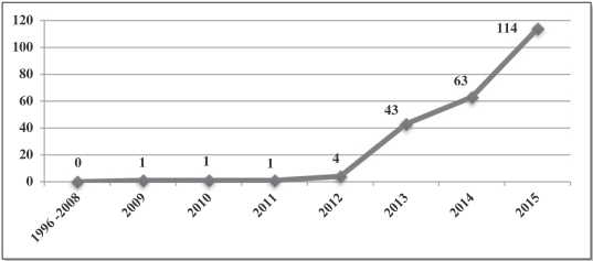
Figure B.5: Sivarajah et al. (2017) - Total number of papers published (from 1996 to 2015)
The top four countries produced 486 papers and China accounted for 49% of those, with Australia providing 10%. Given the plethora of work coming from China and the US (79%), it is important to note how well Australia stands out as a percentage of the size of its population. Australia’ population is currently 24 Million, and even though the UK’s population is 275% larger, they produced an equivalent amount of papers. The figures are even more impressive when considering the size of the population of the US (1,345%) and China (5,742%) (World Bank 2016).
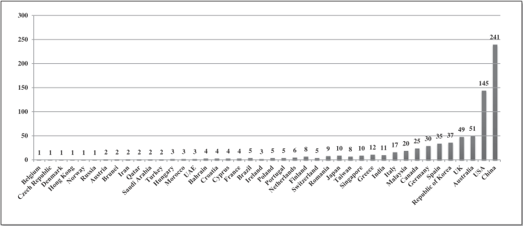
Figure B.6: Sivarajah et al. (2017) - Frequency of researchers from different geographical locations (from 1996 to 2015)
The fact that 74% of the papers were either conceptual/descriptive/theoretical or analytical demonstrates that there is not much thinking occurring the space of application of techniques and the impacts of that. Developing my understanding of this area is what I am interested in exploring further.
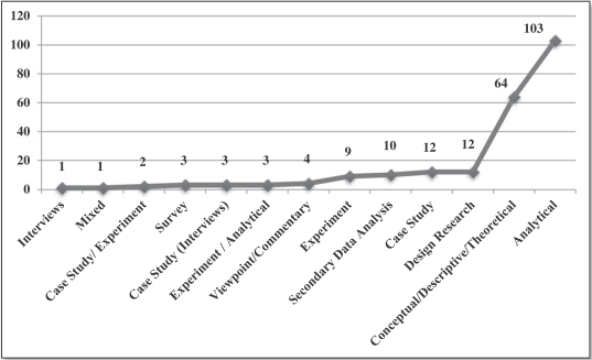
Figure B.7: Sivarajah et al. (2017) - Classification of research methods (from 1996 to 2015)
As an extension to the outcomes of working with highly sensitive data, Pentland (2014) has started to postulate what a future based on social data may look like. In his book, he theorises that humans are as predictable as the trajectory of billiard balls (Carr 2014) if there is enough data, and of the correct kind, known about them. It is an interesting theory that aims to reduce human interactions and actions to a mathematical formula that can then be used to produce the maximum outcome for society by tweaking behaviour through social messaging and small payments.
B.4.3.1 Bibliography
Carr, N. 2014, ‘The Limits of Big Data: A Review of Social Physics by Alex Pentland’, MIT Technology Review, viewed 20 November 2017, https://www.technologyreview.com/s/526561/the-limits-of-social-engineering/.
Crook, R. 2005, Western Bower Bird, viewed 18 November 2017, https://www.flickr.com/photos/richardwc/2109138285/.
Guszcza, J. & Richardson, B. 2014, ‘Two dogmas of big data: Understanding the power of analytics for predicting human behavior’, Deloitte Review, no. 15, 28 July, viewed 16 November 2017, https://dupress.deloitte.com/dup-us-en/deloitte-review/issue-15/behavioral-data-driven-decision-making.html.
Pentland, A. 2014, Social Physics: How Good Ideas Spread - The Lessons From A New Science, 1st edn, Scribe Publications.
Sivarajah, U., Kamal, M.M., Irani, Z. & Weerakkody, V. 2017, ‘Critical analysis of Big Data challenges and analytical methods’, Journal of Business Research, vol. 70, no. Supplement C, pp. 263–86.
World Bank 2016, ‘Total Population’, The World Bank, viewed 19 November 2017, https://data.worldbank.org/indicator/SP.POP.TOTL.