A Appendix A - Visualisation Tool Introductions
A.1 Using Tableau for Data Science Intro
A.1.1 Overview
Tableau is a top tier analytics tool that is a brilliant visualisation tool and excellent corporate Business Intelligence platform. It also lends that visualisation capability to Data Science applications and this blog looks at some of those capabilities. It also has some built-in data science capabilities such as polynomial regression analysis and clustering which are great for quick exploratory analysis.
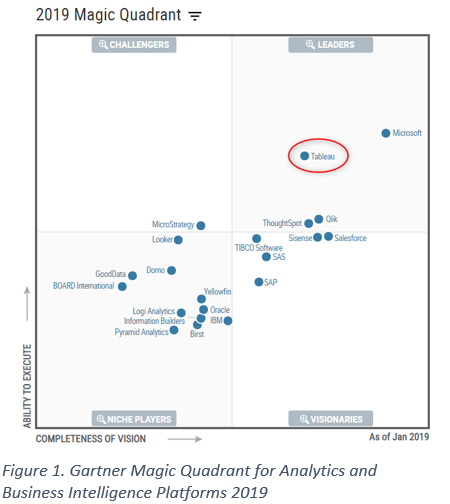
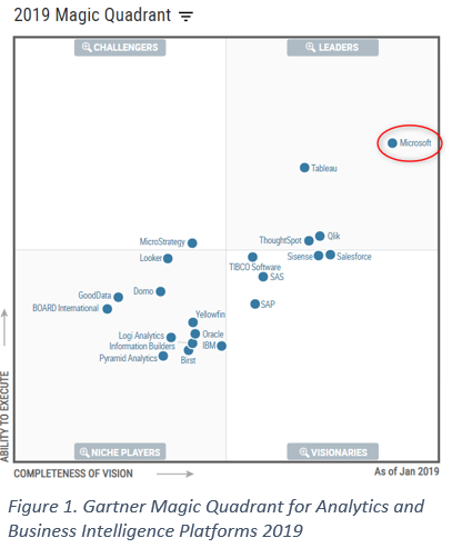
Gartner rates the Tableau platform as high in the Leaders category with only Power BI, which is part of the full Microsoft platform, rating more highly. Its strength is beautiful visualisations, great BI capability and ease of use with rapid visualisation development. Business users can learn this tool quite quickly to enable self-service BI and data scientists can use it for exploratory analysis using regression and clustering. Using Tableau calculated fields, statistical calculations can be added quickly and easily.
Below is the Gartner Magic Quadrant assessment of 2019 BI Platforms.
Some of its built-in “drag and drop” data science capabilities are:
built in linear and polynomial regression including Linear, Logarithmic, Exponential, Polynomial, or Power capability
Kmeans clustering
a Forecasting model with 8 exponential smoothing models available and includes the ability to detect seasonality using both additive and multiplicative models.
Integration with R and Python: the ability to run machine learning code and functions from calculated fields that make calls to the relevant server and return a dataset(s) to Tableau for presentation.
Ability to directly read Statistical file formats: R(.rda, .rdata), SAS (.sas7bdat files), SPSS (.sav files)
Tableau can also do interactive “what-if” functionality that can be implemented very easily using Parameters. These can be manipulated at the front end by the end user via interactive sliders and buttons that can change input values or attributes. This means for a dataset and a model; the model can easily be re-run using new values of the parameters to test other potential outcomes. This is great for forecasting applications and can be interesting for regression.
While the built-in data science capabilities like regression, forecasting etc do have reasonable capability, it does not have the range of algorithms and packages that R and Python, for example, offer. However, they can be accessed via calculated fields that call R/Python routines. The built-in functions are, however, useful for exploratory work and for straightforward applications that suit their models.
If you are deploying Data Science capability broadly in an organisation and have a Tableau platform, it is a great way to deliver operational type capabilities via the standard BI platform.
A.1.2 Regression Example
A simple dataset demonstrates some of these capabilities. It is the Housing Prices dataset from the UCI Machine Learning Repository
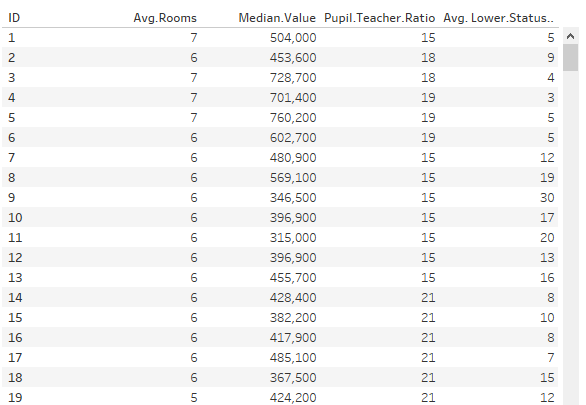
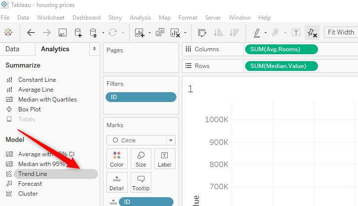
The dataset has 5 variables: ID, Average No of Rooms, Median Value, Pupil Techer Ratio and the average Lower Status % of the population in the area. Looking at a scatterplot of Median.Value vs No of Rooms, we now drag the Trend Line option from the analytics tab and drop it on the scatterplot. There are also options for drag and drop constant, average and reference lines, as well as Box Plots.
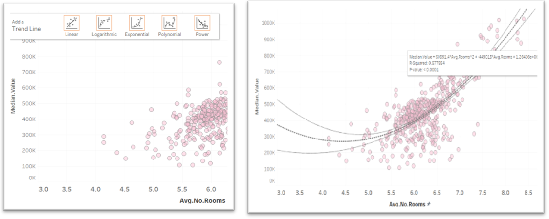
This gives a linear regression line with 95% confidence bands. Left picture shows the options for type of regression option available when dragging the line to the plot. Drop the trend line icon on the chosen option. The image below shows that hovering over the regression line shows the formula, the R-Squared value and p-value.
The trend line can be edited by right clicking on the line to get the edit options so the line type can easily be changed. This also accesses the description of the model
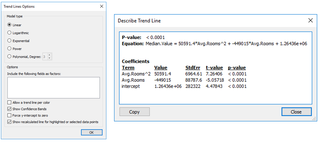
A description of the trend model can also be access from a menu when right clicking on the trend line.
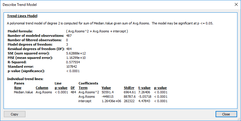
This provides good detail of the model and can be copied an pasted into a document using the Copy button at the bottom of the screen.
A.1.3 Clustering
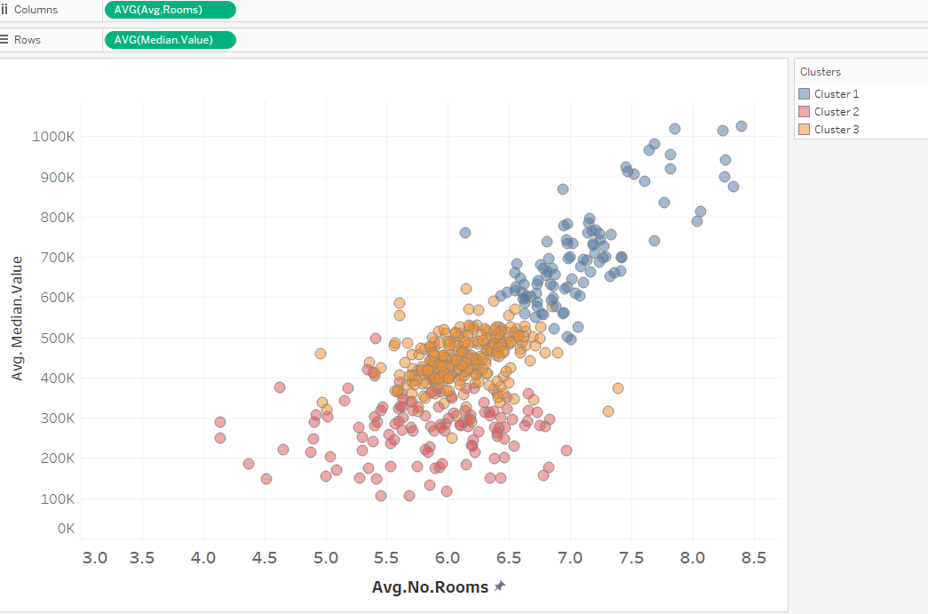
Clustering is just as easy. From the analysis Tab, dragging the Cluster icon to the scatterplot auto selects the optimal number of clusters and variables. These can be edited as required in the same way as regression.
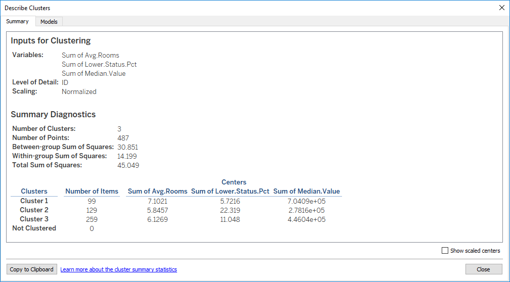
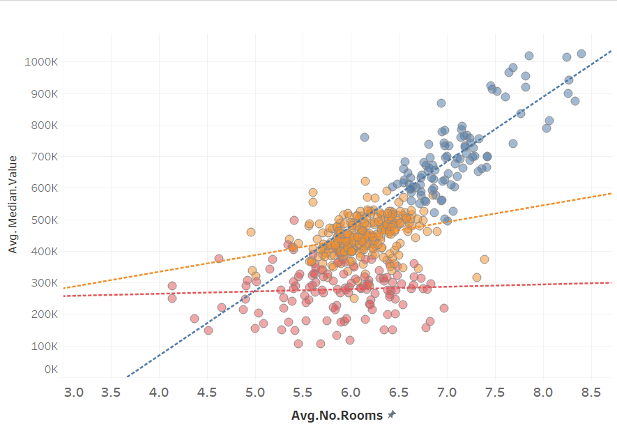
Here it has selected 3 clusters and colour coded them. Additional variable can be added to factor into the clustering model and the number of clusters required is also changeable.
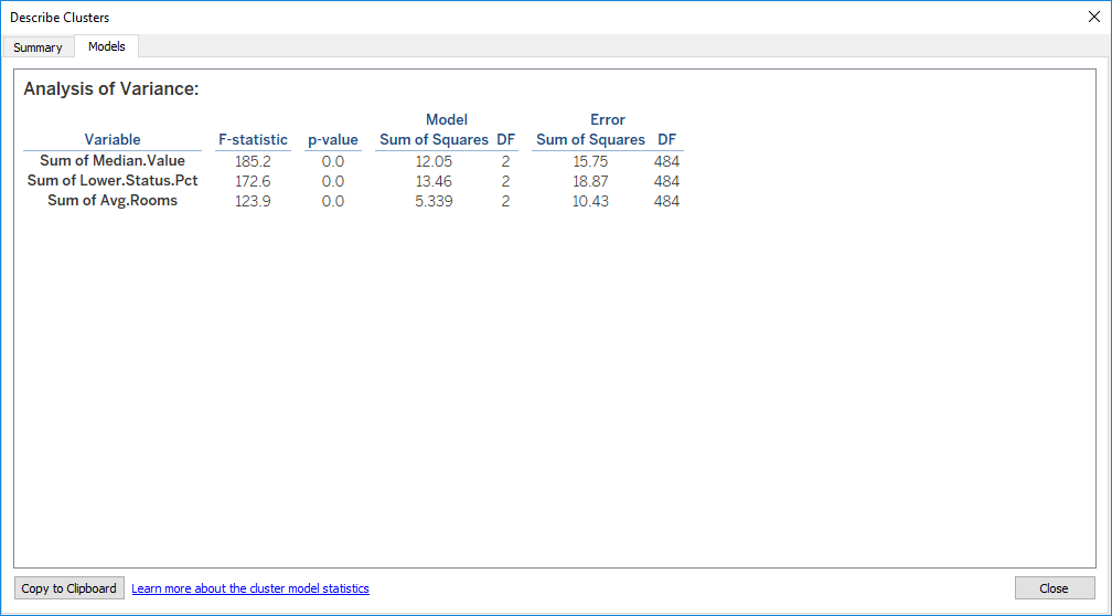
Again, the clustering model description is available in the same way as regression:
Regression can be layered on top of clusters and either a single line or one line per cluster can be specified again by dragging the Trend Line to the scatterplot. Regression using multiple lines can also be used on any categorical data by adding the variable to the colour shelf.
A.1.4 Tableau Database Connectors
Tableau can connect to a huge range of database technologies and file formats directly including reading tables out of PDFs which I didn’t know. It is new this year along with the Statistical file types mentioned earlier. You would be surprised how many datasets are buried in PDF documents!

A.1.5 Tableau (Free) Online Training
If you want to learn Tableau, the Tableau website has a fantastic set of short, consise training videos that start at the basics and go through to the most advanced concepts. You can follow along with the videos on your own machine having downloaded the workbook they provide with the video.
Go to the Tableau Training site and get started. You will need to create and id and sign in to use the videos, but they are free.
If you want to see some great visualisation and what you can do in Tableau see the Tableau Public Gallery
A.1.6 Conclusion
Tableau has got some really interesting data science capabilities which, no doubt, will be added to and enhanced over time. I have just demonstrated a few of them. The integration with Python and R opens up worlds of possibilities.
It is great and very fast for initial exploratory analysis as you can run datasets through a lot of different scenarios to get a feel for the data and to identify anomalies. It is much faster than doing that in R and much more fun to be honest. You can produce very lively, interactive and beautifully attractive front ends for users with this tool.
It is an expensive product and that needs to be considered when looking at the business case for tools in a corporation, however, it is free for students.
A.2 Plotly Package for Interactive Charts in R and Python
Looking for an interactive visualisation tool that can be used in both Python and R for inline charts. Plotly is a package for R, Python and other data science platforms that produces highly interactive and attractive charts with little effort. In R, the most used visualiations package is ggPlot2, however, while powerful, it does not have any interactity such as values showing on hovering with the mouse, including and excluding values, great default colour palettes and many other features.
Plotly which has libraries that support several environments: Python, R, MATLAB, Perl, Julia, Arduino, and REST. Shiny, an R package that allows you to deploy R applications to the web, can be used to deploy dashboards.
Plotly is open source and was founded by a Canadian company in 2012. They have raised significant venture capital (USD5.5M) to expand product line and offer support to enterprises. They have an enterprise pricing and support structure for organisational that want to have more surety around support.
They have an interesting product line-up with Dash for Python, Chart Studio, API libraries for many environments including Jupyter notebooks. It offers Figure Converters for turning matplotlib, ggplot2, and IGOR pro graphs into interactive online graphs. There are Plotly Apps for Google Chrome, an open source JavaScript library and an on-premise enterprise offering. Plotly also offer a platform, in the same way Tableau does, for user publishing their Plotly charts to their online platform. This offers both private and publicly viewable options, which Tableau does not.
Below are two simple plots using the standard “Diamonds” dataset. One showed Boxplots of Price vs Cut, the other was a trend of Price vs Carats. It was then deployed to the web. See live dashboard example for look at a Dash live dashboard.
The many chart types it supports:
Standard Charts: Line, Scatter, Bar, Bubble, Heatmaps, Area Plots
Statistical: Error Bar, Histogram, Box Plot, 2D Histogram, Splom
Scientific: Contour Plots, Ternary Plots, Polar Charts, Network Graphs, Parallel Coordinates, Carpet Plot, Radar Charts, Carpet Contour Plots, WebGL Heatmap, Sankey
Maps: Bubble, Choropleth, Scatter Map, Scattermapbox
3D Charts: Surface Plots, 3D Line, 3D Scatter, 3D Mesh, 3D Tri-Surf, 3D Cone, 3D Streamtube
Financial Charts: Time Series, Candlestick, OHLC Charts
Many multiple axes, subplots and Insets.
One of its strengths for online deployment is interactivity and animation. Most of the types supported default “tooltips” on mouse hover that are highly customisable, similar to Tableau, although you need to do it in code. The animation is quite impressive and very flexible and better than Tableau, though of course it is code (Plotly) vs drag and drop (Tableau).
Custom controls such as selectors (including a range selector for zoom), sliders, filters and buttons are all available. Layering of visual components is also very strong. Like ggplot2, many visual components such as trend lines and points can be layered at will allowing the development of very complex plots more difficult or even impossible to do in a drag and drop environment like Tableau.
Dashboards also are a feature and can be created either online on their platform, or with subplots or in shiny (R).
Shiny is a R package for deploying and R application to the web and can incorporate textual information as well as embedded interactive visualisations. Shiny has a server component and a user interface (UI) component.The application can be published for free on the ShinyApps site if you sign up with an account.
Below is the Shiny Dashboard that has been deployed to the web. It contains two tabs that separate the visualisations. Controls are shows below the plots. The controls are Shiny control but you could use Plotly controls if required.
The first table is a simple boxplot. This is a default colour palette, which is rather nice Note the default tooltips on hover shown below, which are really will done.
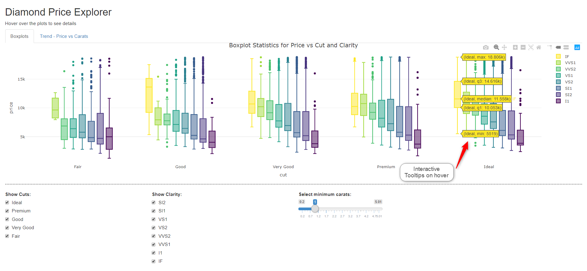
The code for the boxplot chart is very simple and as you can see from the code below and the visualisation appearance is mostly driven by defaults. It produces a really attractive plot. The “group” option allows grouping in most plot types.
library(plotly); library(ggplot2);
data("diamonds")
plot_ly(diamonds, x = ~cut, y = ~price, color = ~clarity, type = "box") %>%
      layout(boxmode = "group") %>%
      layout(title = "Boxplot Statistics for Price vs Cut and Clarity")
The second tab is a little more complex and layers points and two trends, a loess curve and an lm curve. This chart is not supposed to be meaningful, but just an example of layering which can be done very simply and effectively.
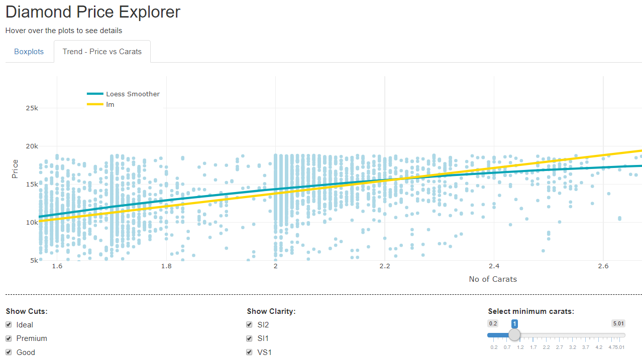
The code for this below is similar to what you would see in ggplot2, but, in my view more straight forward and less coplex. It uses the pipe operator (%>%) to allow easy layering and has a huge range of formatting options to customise visualisations. The add_markers adds a points layer and add_markers layers the trend lines.
library(plotly); library(ggplot2);
data("diamonds")
p <- plot_ly(diamonds, x = ~carat, color = I("lightblue")) %>%
  add_markers(y = ~price, text = ' ', showlegend = FALSE) %>% # add points
  add_lines(y = ~fitted(loess(price ~ carat)),                # loess curve
            line = list(color = 'rgba(7, 164, 181, 1)', width = 4),
            name = "Loess Smoother") %>%
  add lines(y = ~fitted(lm(price ~ carat)),                   # lm curve
            line = list(color = 'gold', width = 4),
            name = "lm") %>%
  layout(xaxis = list(title = 'No of Carats'),
         yaxis = list(title = 'Price'),
         legend = list(x = 0.05, y = 0.95))
p
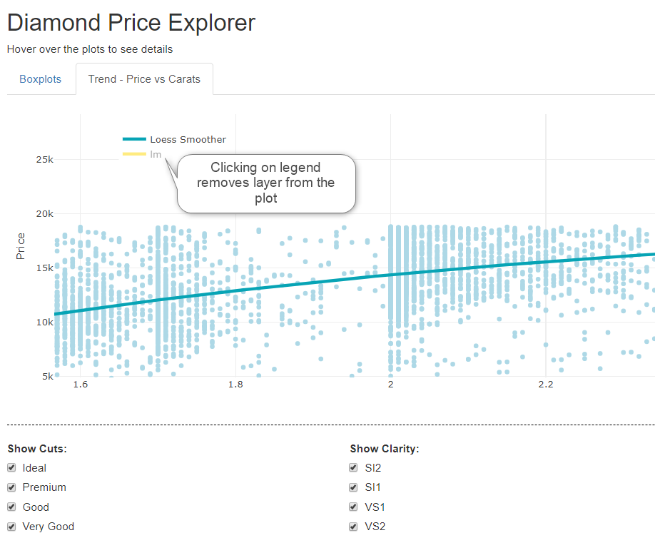
Another nice feature is that clicking on the legend removes and reinstates the line. For categorical legends, it removes that category from a plot.
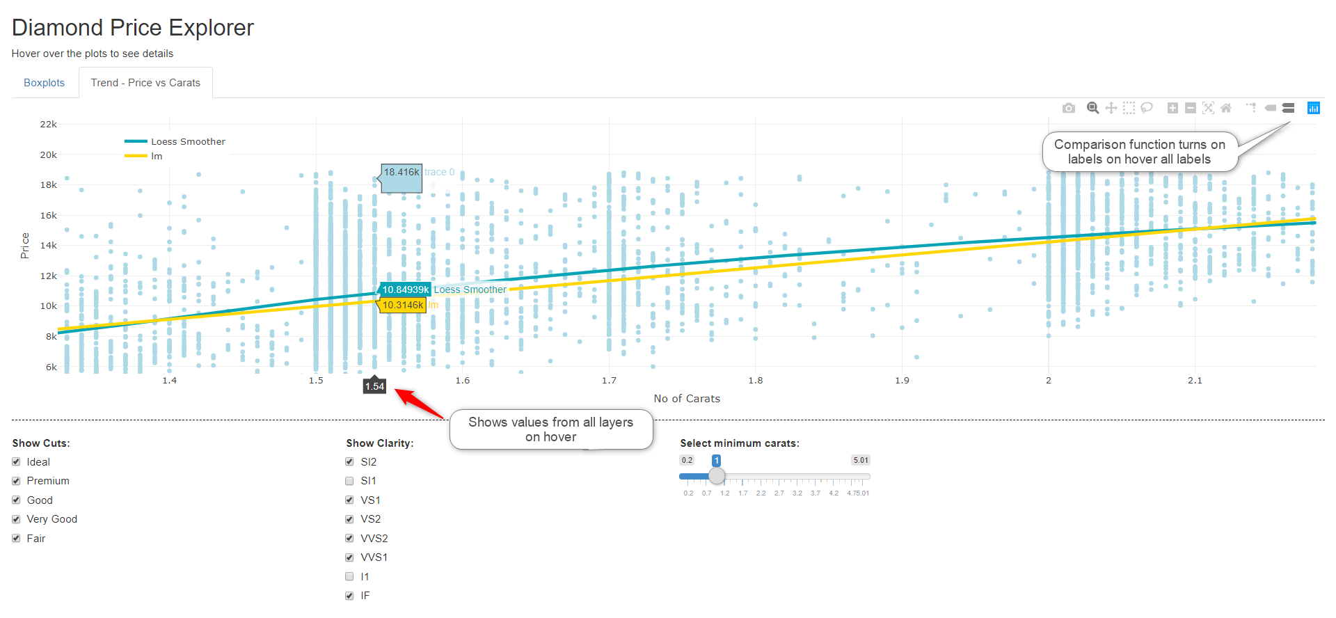
Yet another nice interactive feature of the plots are tool icons on the top right of the plot. They offer zoom, pan, selection and static image download options. They also offer a “comparison” option which will show tooltips for all layers on hover.
Overall, Plotly is a really impressive toolset for visualisation using code, particularly for data science and scientific programming. It is sure not an end user tool as the Tableaus of the world are which limits its use to technologists. It supports multiple platforms and although a lot of the product is open source, there is enterprise support available, which reduces the risks in large and/or important deployments in corporations.
A.2.1 Shiny Code
Although Shiny has not been discuss in any detail, the code for the app is shown below for information.
Shiny User Interface
library(plotly); library(ggplot2);
ui <- shinyUI(fluidPage(            # The User Interface component
    tags$head(
        tags$style(HTML("hr {border-top: 1px dashed #000000;}")),
  titlePanel("Diamond Price Explorer"),
  h5("Hover over the plots to see details"),
  tabsetPanel(
    tabPanel("Boxplots", plotlyOutput("plot")),
    tabPanel("Trend - Price vs Carats", plotlyOutput("trend"))
  ),
  hr(),
  fluidRow(
    column(2,
    checkboxGroupInput(inputId = "Cut", label="Show Cuts:",
         choices = unique(diamonds$cut), selected = unique(diamonds$cut))
    ),
    column(3, offset = 1,
    checkboxGroupInput(inputId = "clarity", label="Show Clarity:",
      choices = unique(diamonds$clarity), selected = unique(diamonds$clarity))
    ),
    column(3,
    sliderInput(inputId = "Carat", label="Select minimum carats:",
              min = min(diamonds$carat), max(diamonds$carat), value =  1, width = 250)
    )
  )
))
Shiny Server The code for the server component for Shiny
server <- function(input, output) {
  output$plot <-                     # Code for Boxplots tab
   renderPlotly({
     plot_ly(diamonds[(diamonds$carat >= input$Carat) &  # for the controls
            (diamonds$cut %in% input$Cut) &
            (diamonds$clarity %in% input$clarity), ],
             x = ~cut, y = ~price, color = ~clarity, type = "box") %>%
        layout(boxmode = "group") %>%
        layout(title = "Boxplot Statistics for Price vs Cut and Clarity")
  })

  output$trend <-                   # Code for diamond points and trends tab
    renderPlotly({
       plot_ly(diamonds[(diamonds$carat >= input$Carat) &  # for the controls
              (diamonds$cut %in% input$Cut) &
              (diamonds$clarity %in% input$clarity), ],
            x = ~carat, color = I("lightblue")) %>%
       add_markers(y = ~price, text = ' ', showlegend = FALSE) %>%
       add_lines(y = ~fitted(loess(price ~ carat)),
                line = list(color = 'rgba(7, 164, 181, 1)', width = 4),
                name = "Loess Smoother") %>%
       add_lines(y = ~fitted(lm(price ~ carat)),
                line = list(color = 'gold', width = 4),
                name = "lm") %>%
       layout(xaxis = list(title = 'No of Carats'),
             yaxis = list(title = 'Price'),
             legend = list(x = 0.05, y = 0.95))
  })
}
Calling the Shiny App
A.3 Microsoft Power BI For Data Science Introduction
A.3.1 Overview
Microsoft Power BI is also (in addition to Tableau) a top tier analytics tool that which is available in multiple options. It is used as the business intelligence platform for many large organisations. The standalone desktop version of Power BI is discussed here. It does not have the integration to the Microsof Machine Learning Platform in Azure in this version. That requires a paid version that has those features. The desktop version is an easy to use analytics platform meant for developers and end users alike.
The entire Microsoft analytics platform is very comprehensive and Power BI Desktop can link to Microsoft’s Azure online platform for Machine Learning, Knowledge Mining and Cognitive services. Thislooks at the inbuilt Data Science capability of the desktop version using R and Python and some builtin functions. Power BI also has an online cloud version available.
Gartner rates the Microsoft platform as top in the Leaders category with only Tableau close to it. Its strength is drag-and-drop ease of use and integration with a range of other Microsoft products and platforms.
It has connectors for many databases and services, including, as I mentioned the Azure analytics platforms. It offers a number of standard graph types (line, bar, treemap, pie chart, heatmap, area chart etc) and does include Sankey (ribbon chart) and waterfall charts as standard. It does not offer much more than standard graph types. However, there is a Microsoft marketplace where other custom visualisations can be purchased.
There are limited “built-in” data science capabilities in the front-end tool other than statistical min, max, std deviation etc functions, clustering and forecasting using drag and drop. However, both R and Python scripts can be used for:
Data Acquisition: Go to File – Get Data – Other Option: Choose either Python or R script which will run a script to process data and bring it into Power BI Desktop as a dataset for analysis. You can run a script with any amount of code (as far as I could tell) to manipulate data into the format wanted as long as it returns an object of type “data frame” in R. It does not recognise anything else like vectors or matrices. I did not look at the type requirements for Python.
Data Manipulation: Go to Home – Edit Queries – Transform tab: This offers R or Python script options to manipulate or transform the dataset that has been loaded. The code could will apply machine learning algorithms to transform the dataset for later visualisation.
Creating Visualisations: From the visualisation tab, there are, among the visualisations on the selection panel, R and Python options. Dragging either option to the visualisation area and dragging onto it one or more fields from the dataset, opens script window where the R or Python script can be edited.
A.3.2 Data Acquisition
R and Python scripts can be used to acquire a dataset from either a database or other source. To do that, go to the “File” menu and under the “Get Data” then click on “more” to get a full list and the “Other” option where there are icons for both Python and R. Not the easiest to find!
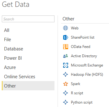
The following window then opens. Enter the script required. It must return a data frame to a variable name. Only actual “data frames” are accepted in R scripts. This imports the Diamonds dataset from ggPlot2 in this example. The required fields for acquisition can then be marked.
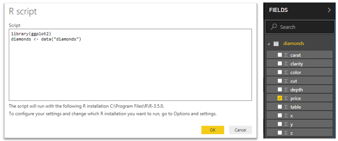
Many types of data manipulation and extraction etc could be used in the script so quite a lot of processing could be done. Another option to manipulate the data is to load a dataset and use the “Transform” option to apply any algorithms or manipulations required. See next section for an example.
A.3.3 Data Manipulation
To manipulate a dataset that is already loaded, Power BI has a “Transform” function that can use R or Python scripts to apply many types of functions to the dataset. To use it, click on “Edit Queries” in the visualisation tab, and go to the “Transform” tab.

The R and Python options are to the right.

Clicking on the R icon will open a script window where you can create a R script to manipulate, summarise or use a machine learning algorithm to return a modified dataset.
A.3.4 Visualisation
Step 1: add a visualisation component
From the Visualisation table click on the R visualisation component in the chart gallery which gives an empty visualisation template as below. Note: you need to have loaded a dataset before this step using File – Get Data.
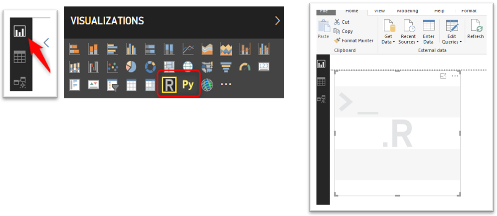
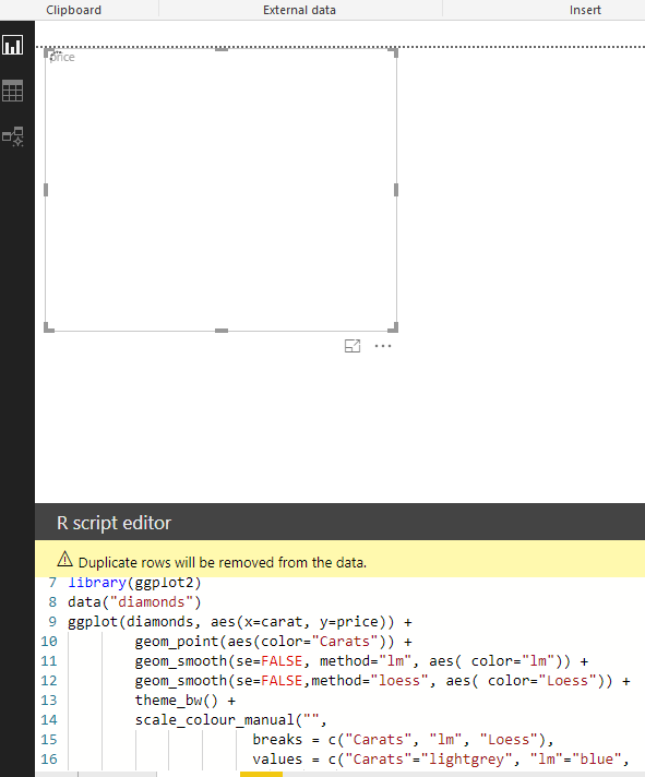
Step 2: Drag any data variable from the dataset to the visualisation template.
This will open a script window where you can then add the code to produce the visualisation. There is an icon in the top right-hand side of the script window that will take you to RStudio or other IDE for editing
Step 3: Click on the “run” button on the top right-hand side of the Script window.
This will run the report and the results are shown as below.
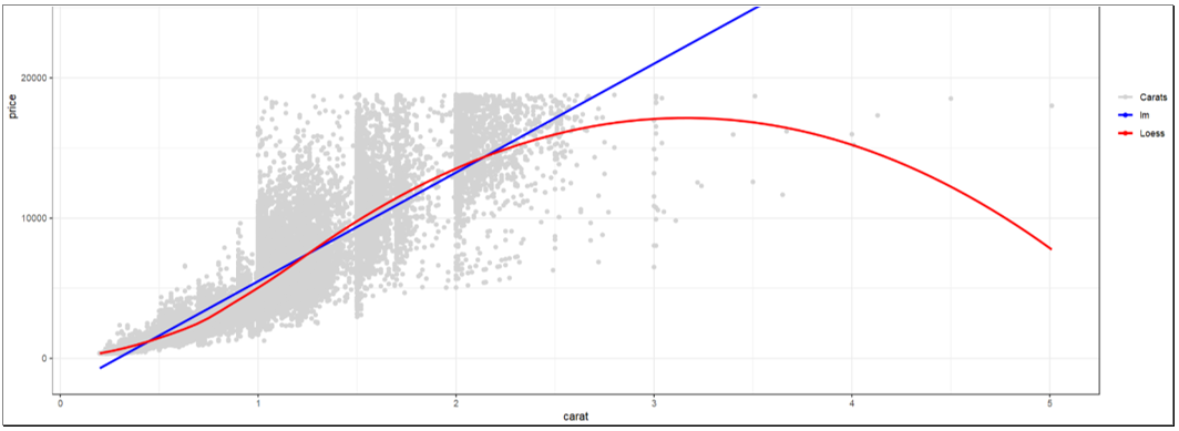
Code for the vizualisation:
library(ggplot2)
data("diamonds")
ggplot(diamonds, aes(x=carat, y=price)) +
        geom_point(aes(color="Carats")) +                           # Layer 1 - points
        geom_smooth(se=FALSE, method="lm", aes( color="lm")) +      # Layer 2 – lm trend
        geom_smooth(se=FALSE,method="loess", aes( color="Loess")) + # Layer 3 – Loess
        theme_bw() +
        scale_colour_manual("",                            # Hoops needed to get legend!
                      breaks = c("Carats", "lm", "Loess"),
                      values = c("Carats"="lightgrey", "lm"="blue",
                                 "Loess"="red"))
A.3.5 Conclusion
Power BI is a top end tool and its integration with R and Python and the Microsoft machine learning infrastructure is very useful. It is used widely in industry as a Business Intelligence platform. Unlike Tableau which offers field level scripts to access R and Python, it offers the ability to use the scripts to operate more as a whole, particularly to manipulate the data. However, the only data for R at least, that you can return is a whole data frame of the dataset. Tableau offers more granular access to machine learning functionality.
As a tool, the standalone desktop functionality (used without access to Azure) similar compared to Tableau but the ability to use R and Python to return any visualisation that can be done in packages is impressive. Also, the Microsoft marketplace for customer visualisation templates adds a powerful addition of capability to Power BI visualisations.
A.4 Qlik For Data Science Introduction
A.4.1 Qlikview
Qlikview and Qliksense are from the same parent company, Qlik Technologies, though the products are a little different. Qlikview excels at reporting or presenting specific topics, which is particularly useful for stakeholder engagement.
Qlikview use as structured visualisation tool. it requires more setup and planning, but the benefits are in its structure, which allows some simple but powerful views, which can be viewed by stakeholders on multiple device types regardless if they have experience in analytics or not.
A.4.2 QlikSense
QlikSense offers governed data discovery and augmented analytics. The built-in ETL capability allows users to seamlessly integrate multiple structured as well as unstructured data and can build data warehouse or data mart that follows a traditional business intelligence architecture. It supports many data sources – databases, big data, cloud data, but with the difference that the associative engine produces an integrated view of data with in-built knowledge of the relationships between different sources. The in-memory engine supports multiple sources and data models and can perform complex calculations.
A.4.3 Loading the data:
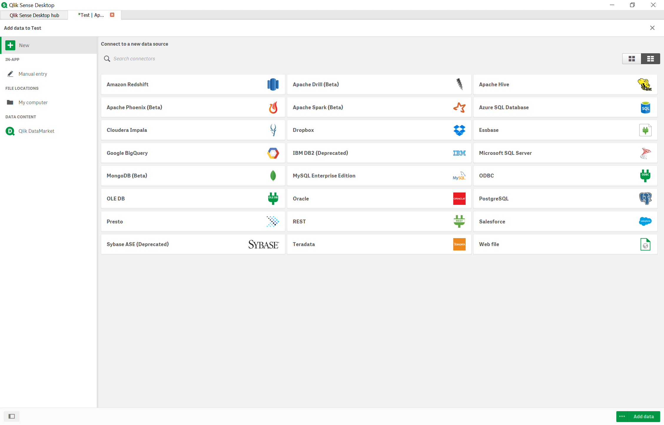
Qlik Sense create visualisations by creating apps and it can be shared through the cloud with other users. The interface is user-friendly and tables or spreadsheets can be combined to build a data model.
A.4.4 Features & Functions
QlikSense has more features than Qlikview.

It is not that expensive product like Tableau. Most healthcare company and Government agencies use Qliksense as their visualization tool.
Students can get Academic license for free at their Academic Program site.